REISHI x ECOVATIVE
OBJECTIVE
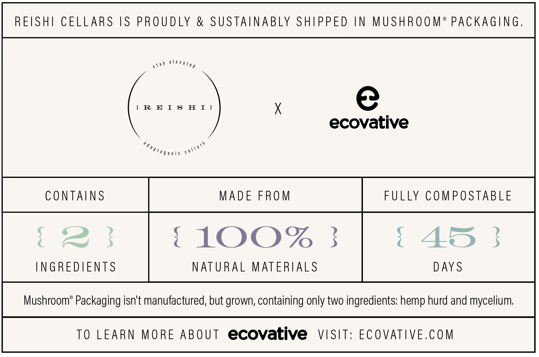
The aim of this project was to create and brand a mushroom-themed wine sampler box in collaboration with Ecovative Design, a company that specializes in producing sustainable and environmentally friendly packaging materials out of mycelium.
INTRODUCTION
When you think of wine, you probably would not typically associate it with mushrooms. That is, unless you were thinking of Reishi. Reishi was a wine company developed in collaboration with the sustainability company Ecovative to help showcase their alternative packaging solutions. Wait, what does any of this have to do with wine and mushrooms? Well, Ecovative’s packaging supplies are manufactured entirely from 100% compostable mycelium which means you can keep more waste out of landfills and feel good about your environmental impact. In order to help Ecovative showcase their packaging, Reishi Adaptogenic Vineyards was born. I would then go on to design, brand, and stage three different bottles and a shipping box.
INSTRUCTOR: Bryan Satalino
INSTITUTION: Tyler School of Art & Architecture, 2022
RESEARCH
The first step in my brand development was to learn more about Ecovative as a company so that I could figure out how to go about building a concept for this wine company. I spent time in meetings in tandem with my colleagues and Ecovative representatives to hear more about the company’s goals and the science behind the mushroom packaging itself. Obviously mushrooms play a pretty huge role in the whole process so it felt only natural to center them in my own branding approach. My initial research consisted mostly of brainstorming my conceptual approach to this wine company, followed by some potential brand names.
APPROACH
After learning more about mushrooms than I ever thought myself capable, I decided that the most intriguing were reishi mushrooms. This fungi, native to East Asia, is truly impressive for more than its fancy name. Reishi mushrooms, when consumed, provide the body with adaptogenic benefits that promote overall human wellness. Why not – I figured – apply this concept of wellness-boosting adaptogens to one of mankind’s favorite beverages? Yes, let’s put it in the wine.


A reishi mushroom


NEXT STEPS
After I ironed out my concept, I got to work on sketching out my ideas for the logo, bottles, and label design. I had to decide what vibe I wanted to go with for Reishi in terms of brand identity. At first, I toyed with the idea of going in a more playful, eclectic direction for Reishi. However, something wasn’t really clicking for me there. So, I continued to explore my options for a better fit. Through the process of trial and error and a whole lot of constructive feedback from my instructors, colleagues, and Ecovative representatives, I landed on something with a little more edge. My logo streamlined with a gorgeous, high-impact typeface that set the tone for the rest of the branding. I switched gears and went straight in for a minimal, typographic-based logo and label design.
My next challenge was to figure out the actual bottles themselves. The objective was to create three different bottles for this theoretical wine-sampler box. So, I have my logo planned out and a rough idea of what my labels will look like, but what am I going to do about the bottles? I’ve seen plenty of wine bottles in my life so I know what they typically look like. Truthfully, the whole “regular glass bottle” thing wasn’t really doing it for me. I wanted my theoretical wine bottles to create a little bit of buzz. I wanted them to spark some interest. So, instead I opted to illustrate and design a wrap for each wine bottle. The whole time was thinking earthy, thinking mushrooms, thinking nature. I went back to research and like a good little designer, I Google Image searched “mushrooms” and just started scrolling and scrolling for inspiration. As it turns out, mushrooms are actually pretty beautiful if you flip them over and check out all their little patterns on the underside of their caps. Bingo. I had a plan. I did a little thinking, a little sketching, and then I took myself over to Adobe Illustrator and used vectors to create three different (but related) mushroom patterns for my bottle-wraps. Additionally, in contrast with my minimal and type-based labels, the patterns really popped. Yes, I was pleased.

With my illustrations all mapped out, I moved on to developing my color palette. Like with my logo and labels, I wanted to keep it simple. I sussed out three muted, earthy, vaguely moody colors that work and I was all set and ready to apply them to my labels and bottles. It was all coming together now.
SHIPPING BOX DESIGN, STAGER & FANTASTIC FOLD
With the bottles all sorted and manifesting in my little 3D Stager space, the next step was upon me. These bottles needed a home. So, I get to work planning out my shipping box. I wanted to keep it reminiscent of my minimal labels while still achieving some level of contrast and “reveal.” So, back to Illustrator. I kept the outside simplified – black type on a creamy off-white with a singular pop of color, roomy and sleek, maybe even delicate – and I left the reveal for the inside. I could see it in my mind’s eye; open the box up and WOW, there’s the bottles in all their glory. The patterns provided so much visual intrigue when paired with the minimalism of the shipper box and the labels. Again, I was pleased.
I exported and brought my box designs into Fantastic Fold and got right to folding. After exporting a handful of differently staged .obj files from there, I was ready to head back over to Stager and put the whole thing together. With a little lighting help and some more Google Image inspirational scrolling, I was ready to start rendering my final images.
CONCLUSION
Reishi was, from start to finish, an enjoyable project that left me feeling proud and satisfied with the final images. Part of the appeal for me was how involved it was, how gratifying it was to march through each step in the process from research to render. Additionally, it was great meeting with and getting input from the Ecovative team as my colleagues and I progressed through each step. I truly never thought I would come out of a package design project with such an extensive knowledge of mushrooms, but I guess life’s greatest pleasures are rarely expected.


-
![]()
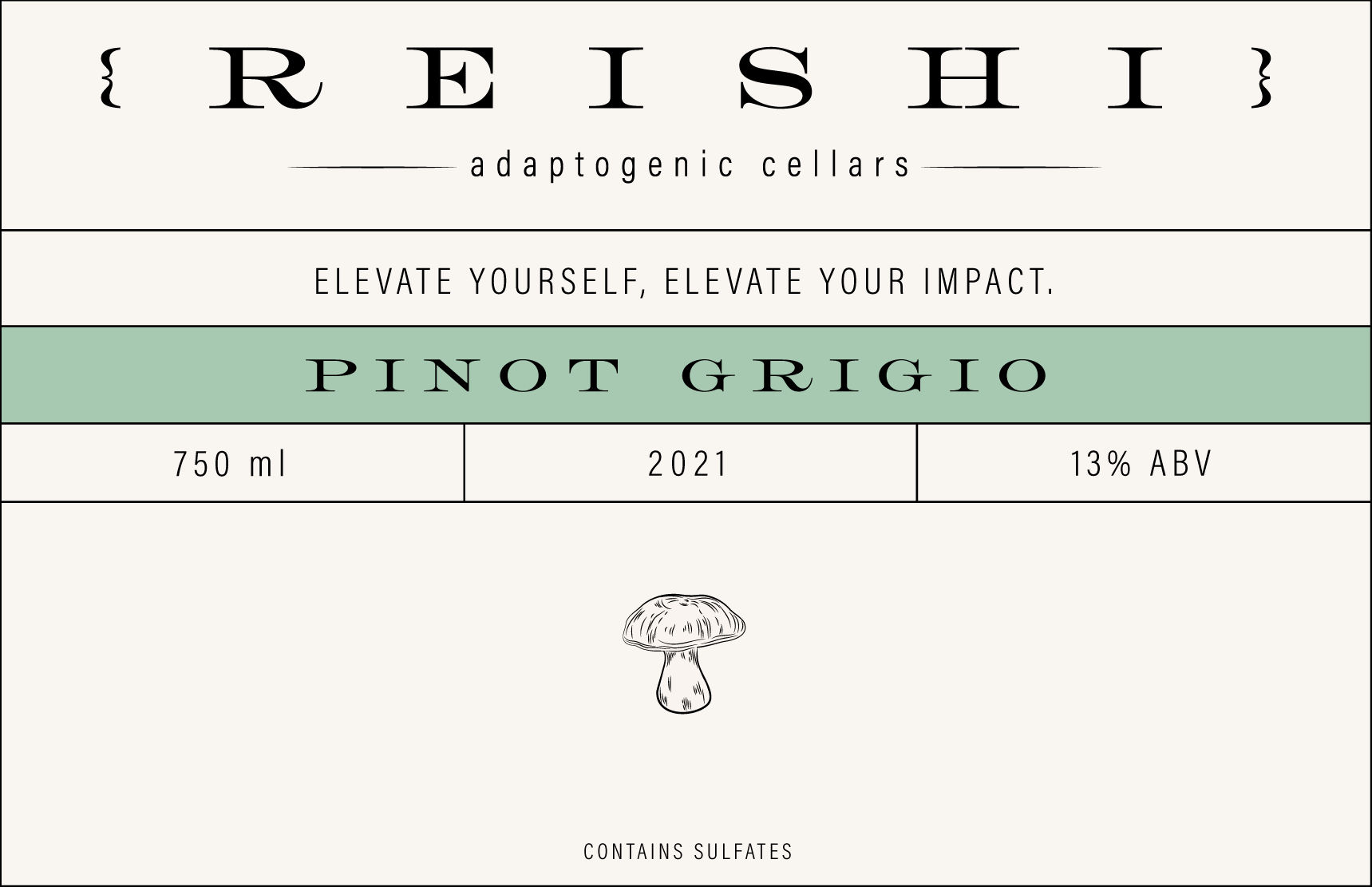
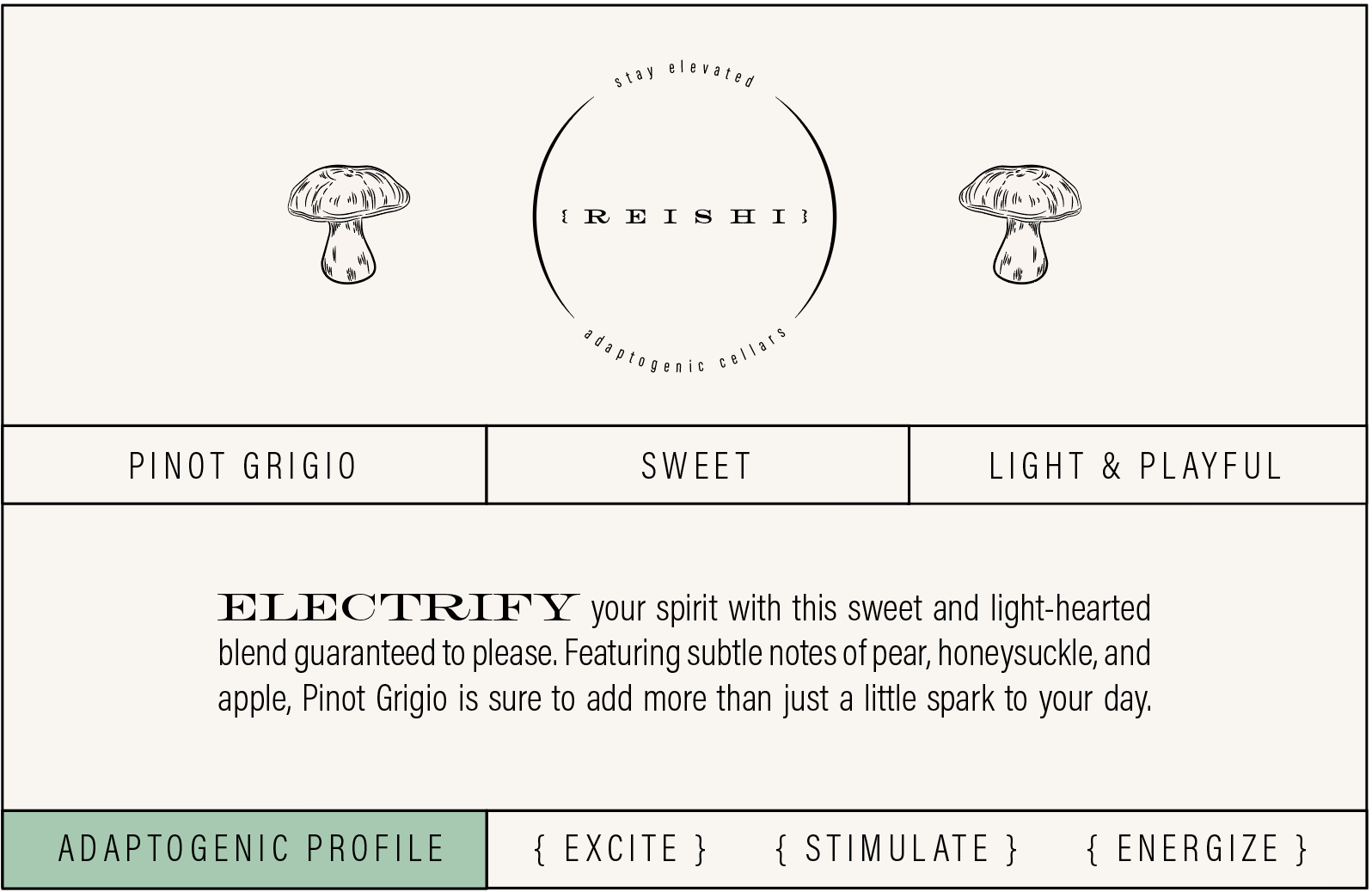
Pinot Grigio Front Label
-
![]()
Pinot Grigio Back Label
-
![]()
Chardonnay Front Label
-
![]()
Chardonnay Back Label
-
![Sauvignon Blanc Front Label]()
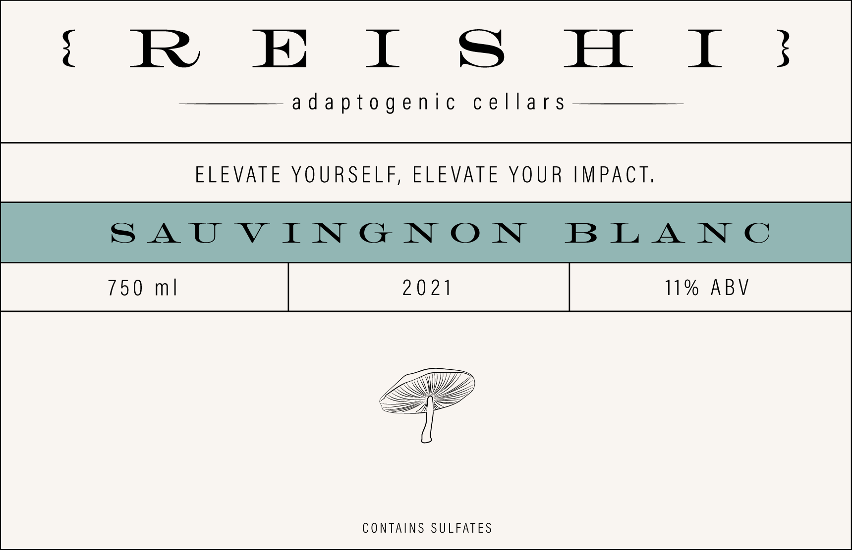
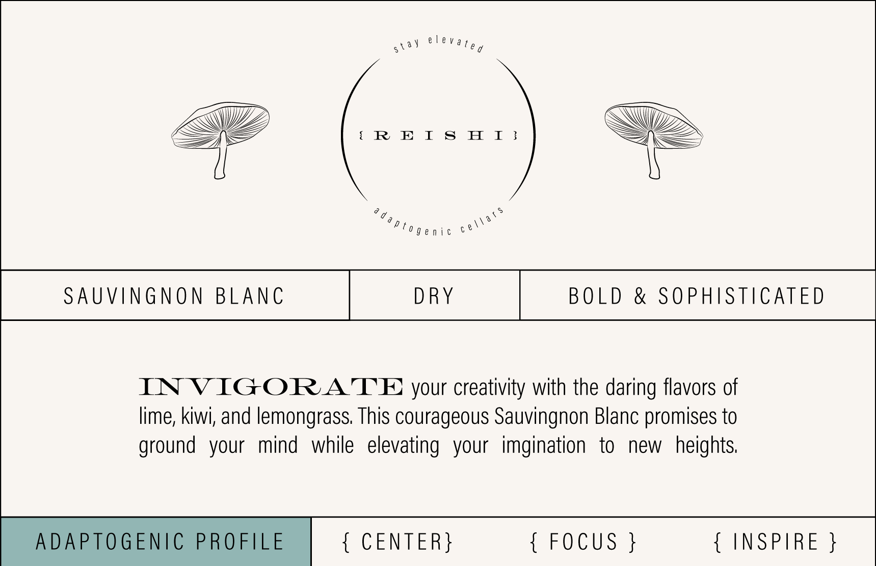
Sauvignon Blanc Front Label
-
![]()
Sauvignon Blanc Back Label
-
![]()
Shipper Box Inside Label